File Pattern Management System
This project focused on redesigning a secure file transfer and onboarding system used by internal teams to manage client data integrations. The platform handles the intake, validation, and setup of data pipelines — including sensitive health data — and automates tasks like encryption setup, ticket generation, and file pattern validation.
My Role: UX Design, UI Design
Methods and Tools: Conducting Stakeholder Workshops, Usability Studies, Information Architecture, Figma, and Figjam

The Problem Space
It took 3 to 4 weeks to get a client onboarded and their file patterns created. There were Word docs, Excel sheets, manual ticketing, and lots of “Did you get my email?” going around.
Account Managers were chasing down missing info. Admins were rewriting broken intake forms. Nobody really had a clear view of what was happening, or when anything would get done.

“We send everything to admin and then… we just wait.”
Mapping the Chaos

We kicked off with understanding how things were really happening behind the scenes. We mapped the entire end-to-end user flow — from client onboarding to file pattern creation and enablement.
This helped align cross-functional teams (Product, Ops, UX, and Engineering) on:
Who owns which steps (AM vs Admin vs Automation)
Where the bottlenecks and handoffs occur
What inputs and outputs were expected at each stage
How backend logic (e.g., SNOW triggers, Protegrity approvals) connected with the UI


What research told us
We began by conducting a heuristic evaluation of the existing file management portal, identifying key usability breakdowns and found 11 major usability issues.
Talking to the SMEs
Once we mapped the chaos, we talked to the right people to find out what was really going wrong — technically, operationally, and behaviorally.”

Heuristic Analysis


We conducted interviews with:
Account Managers
Admins
Product team leads
Ops specialists
This helped uncover:
What was triggering issues under the hood (e.g., lack of ownership, backend ticketing delays)
What legacy behaviors existed (e.g., Excel and email dependency).
What expectations users had about the system vs what it actually did.
As we spoke with SMEs, product managers, and operational leads, it became clear that the current system needed to be replaced with a new unified onboarding experience.


Our Findings


Users struggled to complete forms due to overwhelming field volume and lack of structure, often skipping technical inputs they didn’t understand, leading to incomplete or error-prone submissions.
“We end up rewriting half the forms just to clean things up.” – Admin

Fragmented systems and disconnected request tracking made it difficult to trace client progress, often forcing teams to dig manually across platforms to link SNOW tickets, forms, and client queries.
“We get messages like ‘which request number is this?’ and then we scramble to find it.” – Admin

The absence of a clear rejection and feedback loop created confusion and stalled progress, as users received no guidance on how to fix errors or who to follow up with.
“It got rejected... but I don’t know what I missed.” – Account Manager

Users lacked confidence in the system due to limited visibility and no clear sense of progress or roles, which led to constant follow-ups, hand-holding, and reliance on informal communication channels to stay updated.
“After I submit, I have no idea what's happening. I usually just ping someone to check.” – Account Manager
Who we were designing for
Admin

Account Manager

Mapping out the Automation Flow
Automation was fundamentally integral to the solution. Through discussions with the core working groups, which comprise system architects, developers, and project managers, we were able to identify key processes that could be automated,increasing user efficiency.

End-to-End User Flow
With a clear understanding of user flows, we can streamline multiple processes, reducing friction, and ensuring that users can achieve their goals with minimal effort.

👆
**This map captures the full redesigned journey across AM and Admin roles. Due to its scale, the image here offers a high-level snapshot — detailed sections are shown below for clarity.

👆
This section highlights the redesigned experience for Account Managers — from intake to submission and feedback.
Wireframes
Using Wireframes to Guide the Design
Wireframing helped us organize key features and stay focused on what the service portal needed to do. It also made it easier to share and confirm our design approach with stakeholders.


Usability testing
To validate our redesigned flows, we conducted usability testing with both Account Managers and Admins, using a mix of remote and in-person sessions.
Participants were given guided tasks that reflected real scenarios — from onboarding a new client to submitting file pattern details with PHI.
We tested with Figma prototypes, encouraged users to think aloud, and captured both behavioral observations and direct quotes.
Key Findings
FROM
01. Admins often had to rely on Account Managers to create file patterns, leading to delays when key details were missed or overlooked.
02. There was no visibility into who made changes during the WIF or file pattern process, leading to confusion and accountability issues.
03. Account Managers struggled to find the right contact for WIF-related updates, often spending time calling multiple people for clarification.
04. Our usability testing results indicated that only 2/5 of users were able to edit the PHI with some guidance.

TO
Design and Strategic Implications
01. We enabled the editing of WIF for Admins, reducing back-and-forth and giving autonomy to correct gaps without delaying the workflow
02. We introduced version history across WIF and file pattern creation, ensuring transparency and traceability at every step
03. We clarified internal points of contact and streamlined escalation paths within the system to reduce time and confusion during updates..
04. We redesigned the PHI editing interface and introduced onboarding guidance to improve usability and boost user confidence.
Final High Fidelity Wireframes
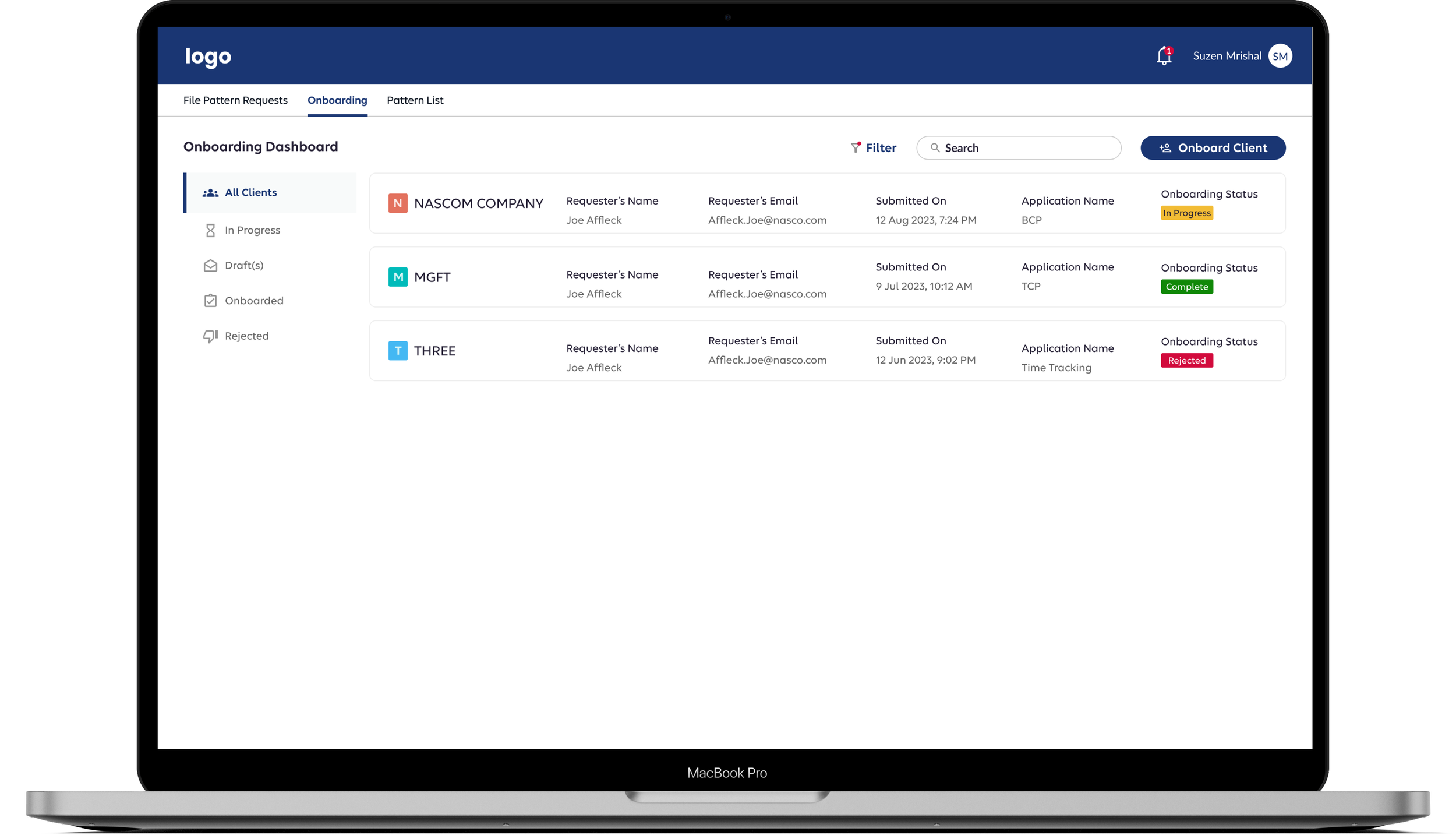
Onboarding, Made Effortless with No More Guesswork
Replaced complex, offline onboarding with an in-app flow that’s trackable, streamlined, and transparent. Built-in rejection comments and real-time status updates keep users informed at every step.

Fast, Flexible Uploads
Users can drop in a sample file to auto-fill large datasets—no manual entry, no delays, reducing the overall cognitive load.


Bulk Editing for Power Users
Designed for advanced users, this feature enables editing of multiple datasets at once—speeding up workflows and boosting efficiency.

PHI Editing with Ease
Only 3 in 8 users could edit PHI with ease. We introduced a contextual slide-out panel that surfaces only when needed, reducing cognitive load and guiding users through a more focused, error-proof editing experience.

Track Every Change
Version history ensures accountability by logging all updates and preventing unauthorized changes.


Prototype
Success Metrics
60% Increase
in succesful approvals
86% Reduction
in Processing tIme
Conclusion
This project was a deep dive into cross-functional collaboration. Working with multiple stakeholders across UX, product, and architecture taught me the value of domain immersion and active alignment. Navigating different perspectives helped me sharpen not just my design thinking, but also my ability to translate complex requirements into usable, meaningful solutions.
Being open about our process, including where we needed time to explore solutions, helped manage expectations. Co-creating timelines and working plans with stakeholders not only kept the project on track but also created a more invested, collaborative environment
